Client / Waynes Coffee
Project / Coffee chain concept
Collaborators / Concept developed by Studio Peter Lundbergh in collaboration with Studio Cilla, Vivi Sumpton and Studio Böttiger
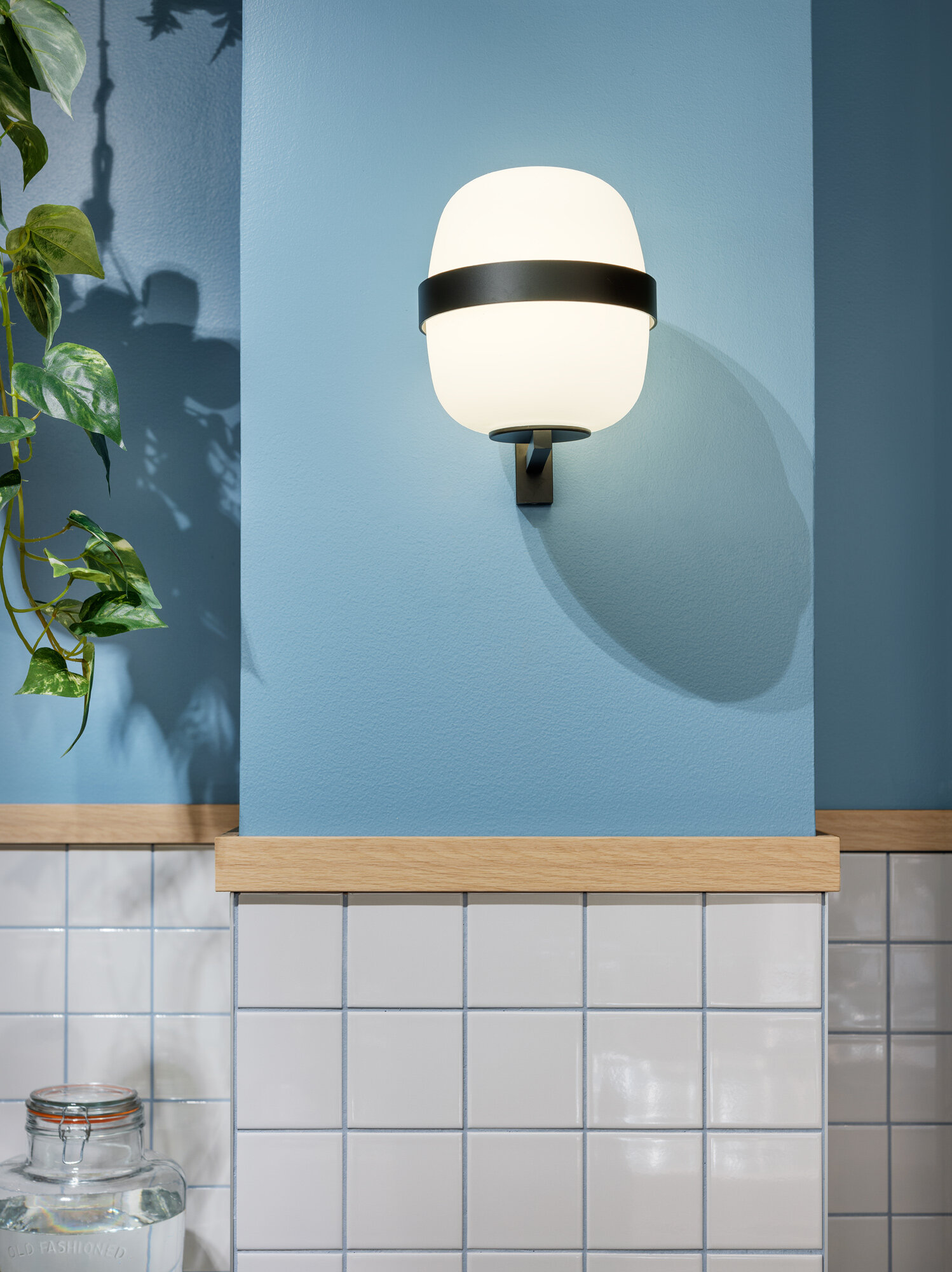
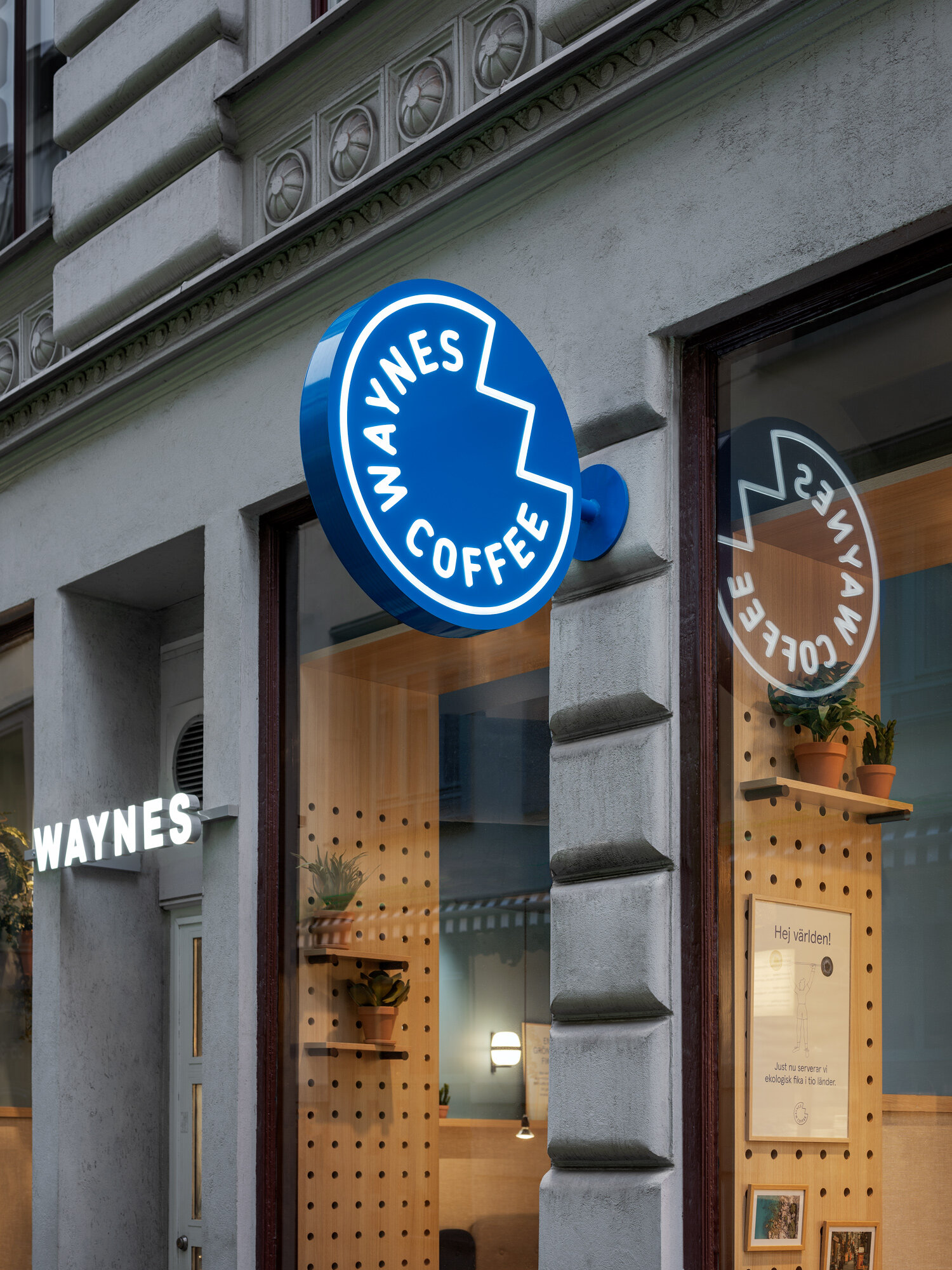
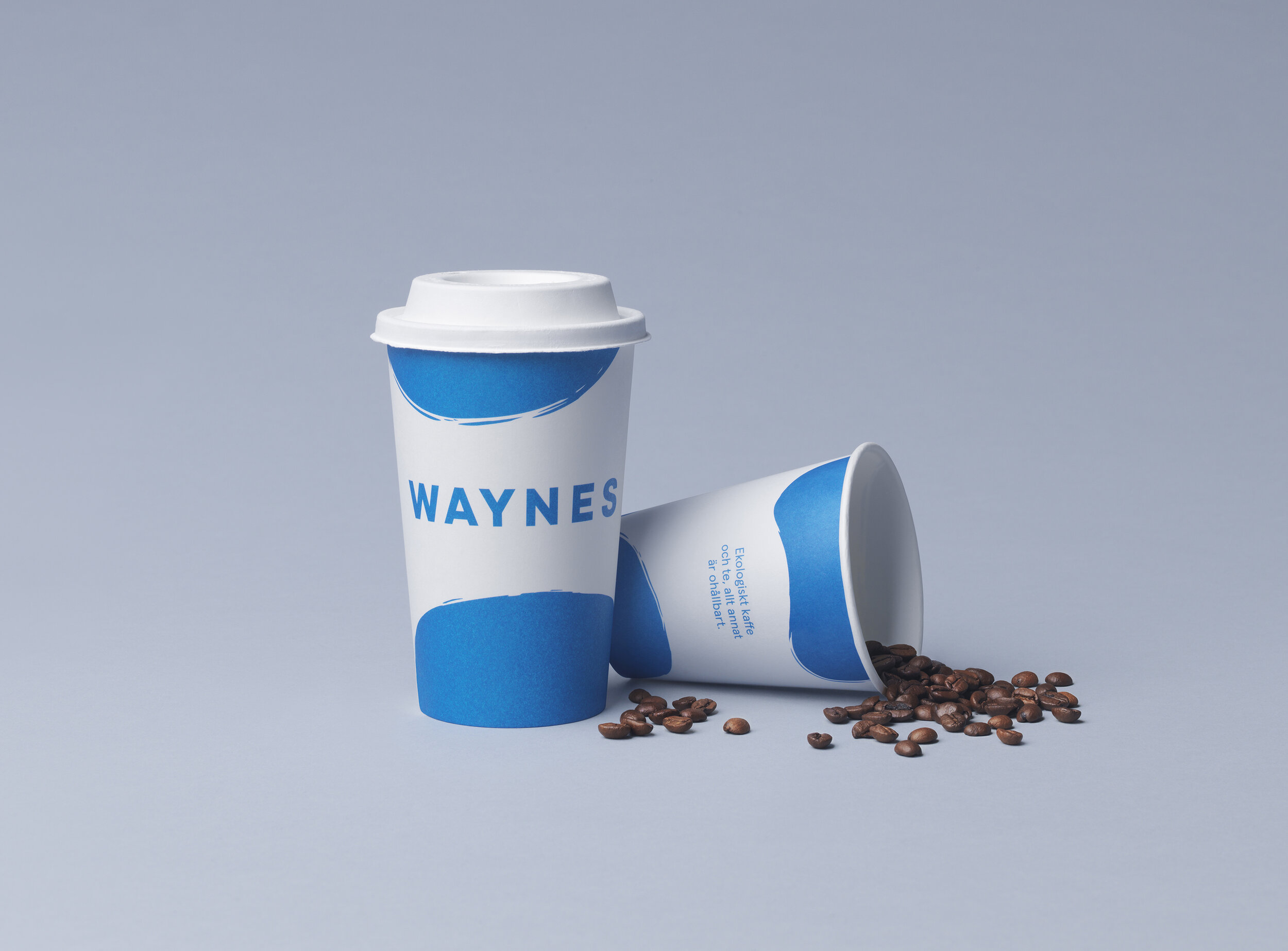
Deliverables / Interior concept / Layout / Lighting / Signage / Brand identity / Packaging design
Contractor / ITAB
Photos / Patrik Lindell
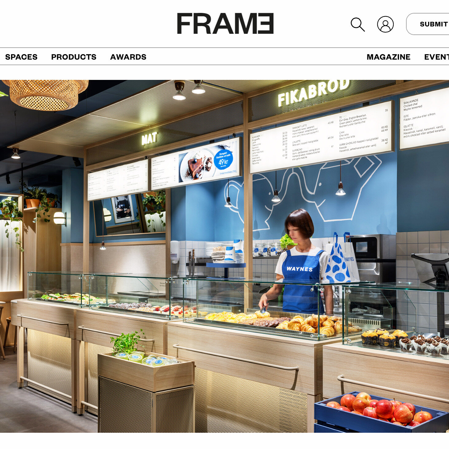
Waynes Coffee

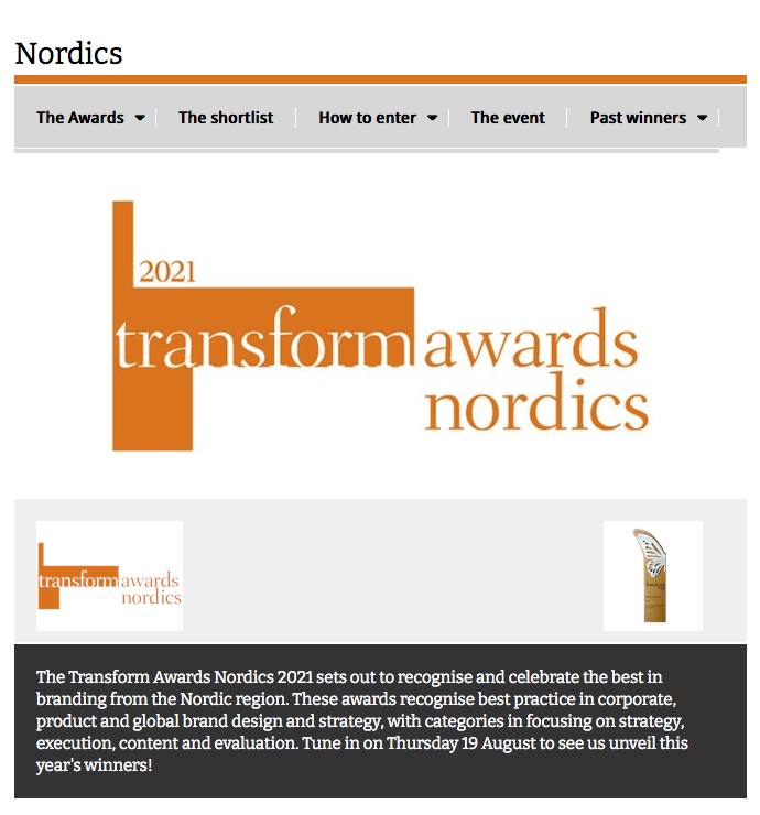
“Judges loved this. One called it ‘well-researched, planned and executed.’ Others praised the friendly, distinctive and inherently Swedish style built into the new brand”
/Transform Awards Nordic

About
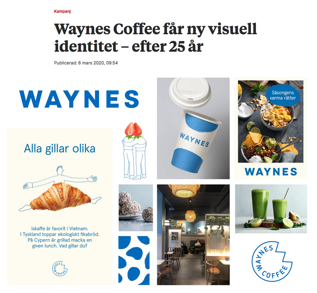
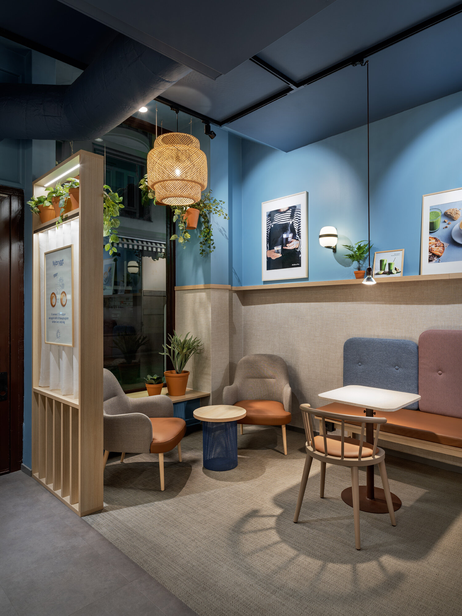
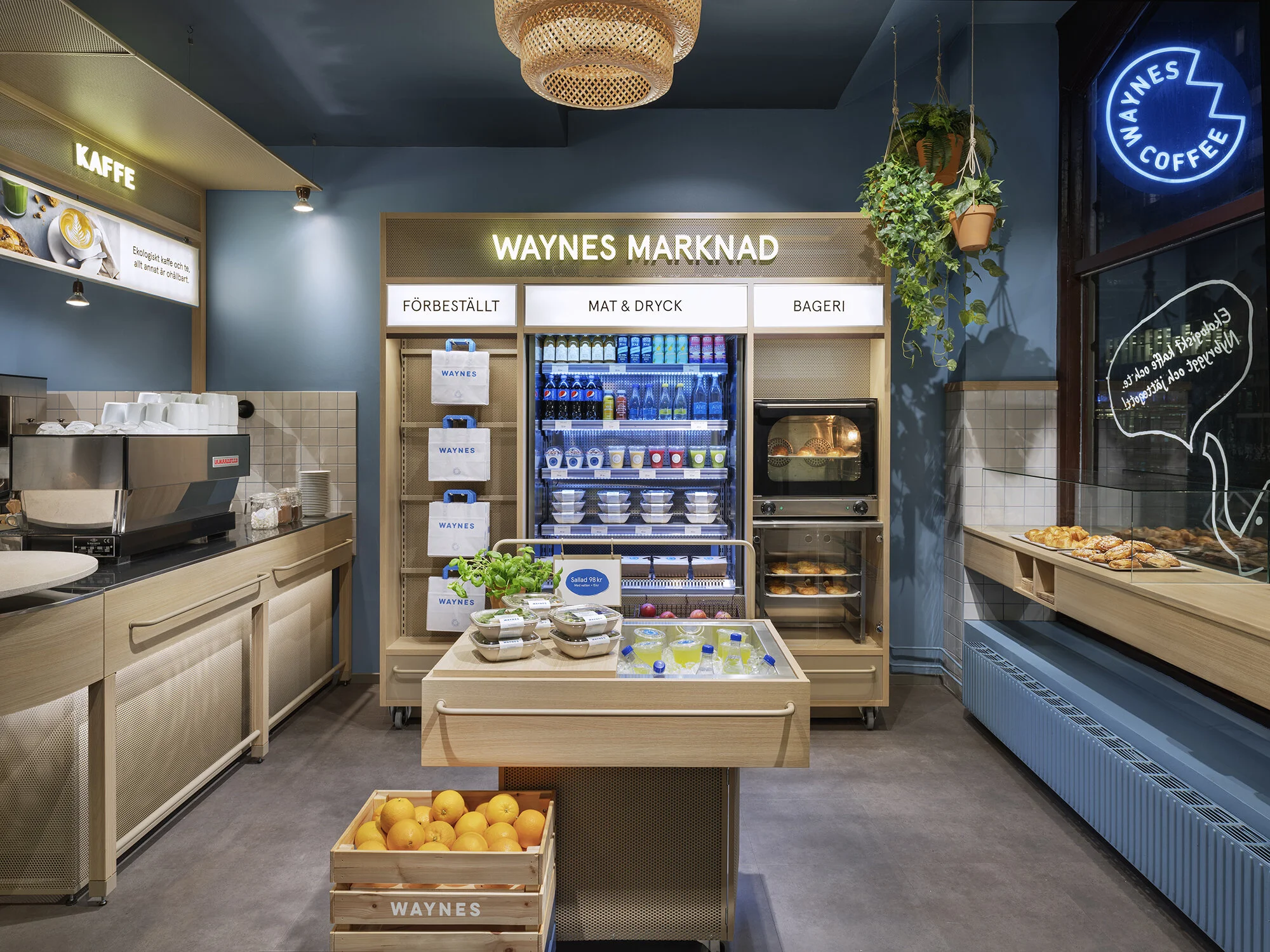
For the first time in 25 years an updated visual identity for Waynes has been made.
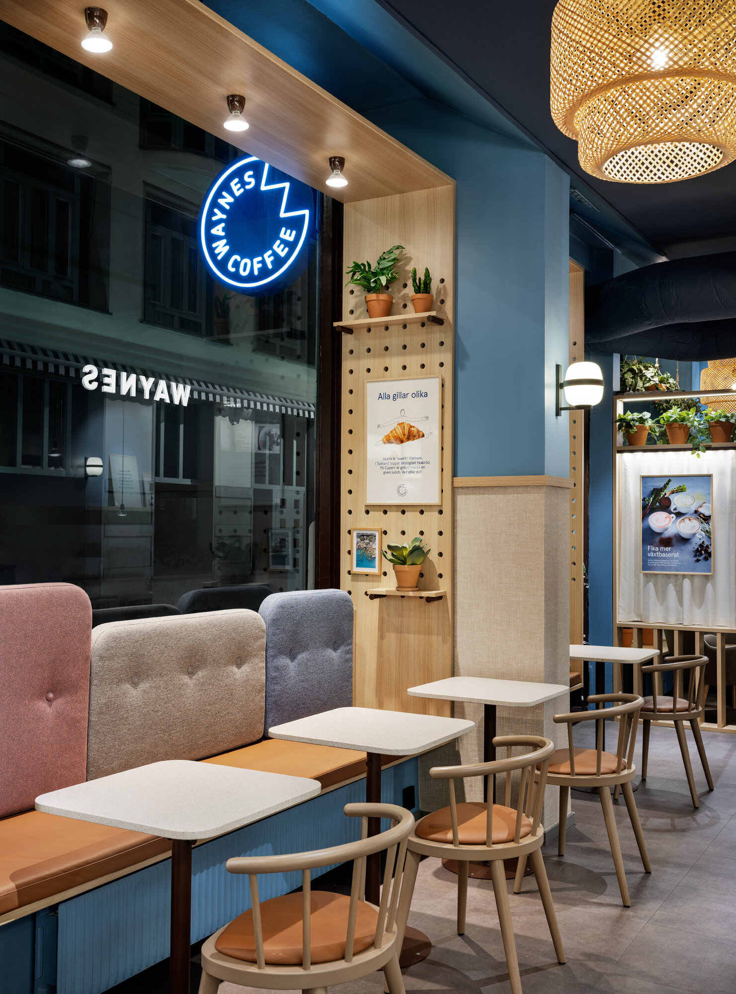
A project that also included a total re-make of the interior concept and a new service offer.
Waynes Coffee was launched in Stockholm in 1994. A concept that introduced the American
coffee culture to Swedish customers. In recent years the coffee chain had lost in sales –
partly because of the growing competition within the category and partly because of a gradually
weakened brand. A rapid global expansion had also high-lighted the need to strengthen the
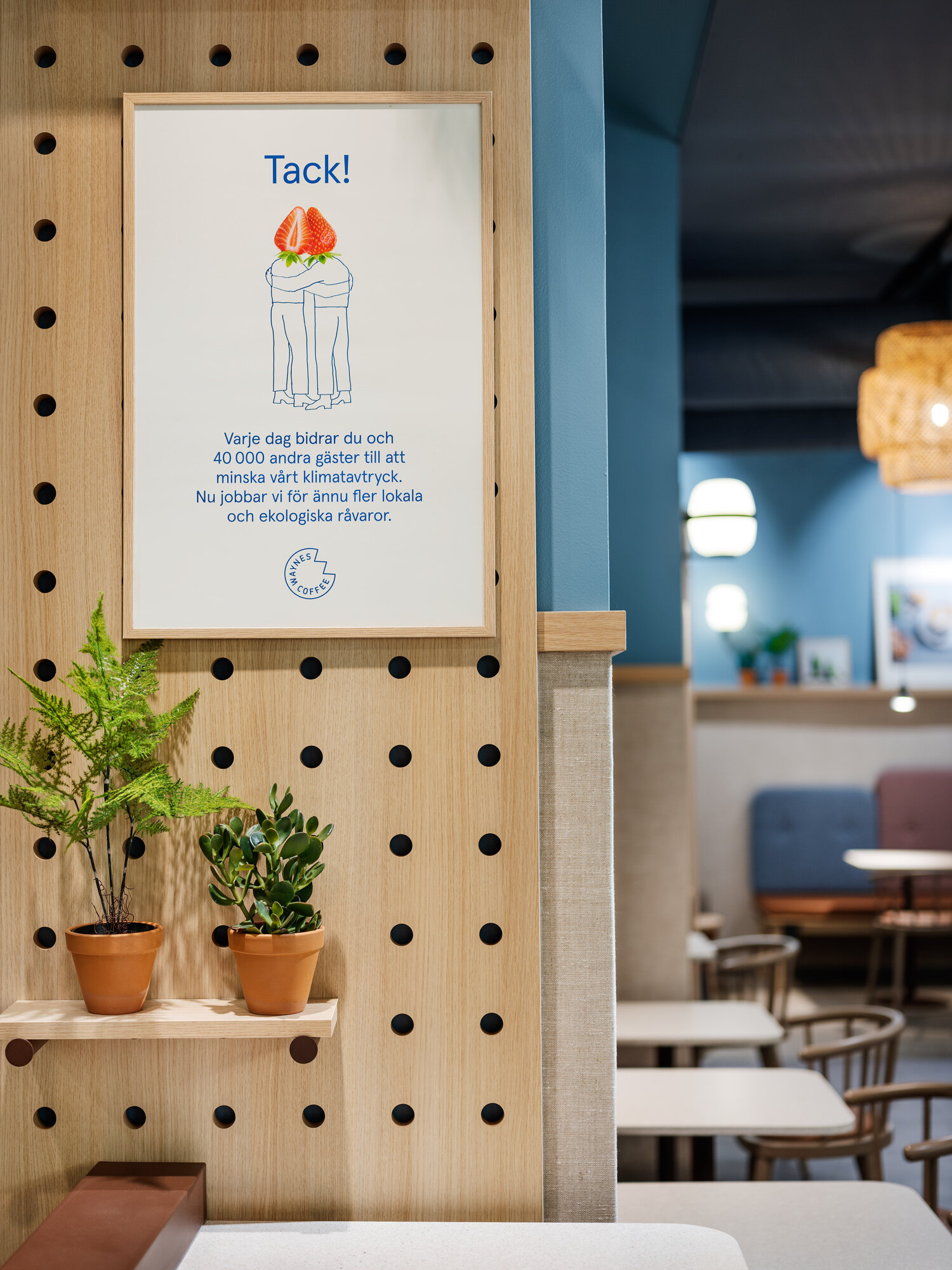
brand identity and to communicate the Swedish heritage. The new concept aims to create
a home for the Scandinavian ”fika” culture and to express the joy of food and coffee
– ”The Fika Market”!
A revitalized identity framework creates an inviting space for the many occasions; coffee to go,
co-working, the date, order by app etc. The blue Waynes colour had gradually been devalued
throughout the years by the introduction of numerous complementary colours and a brown-ish
interior that is typical within the category with a low level of personality as a result. With the choice
of a new, fresh and brighter Scandinavian blue the new concept embraces the brand colour and
makes it the star again. This together with playful graphics, inspiring photography and tactile
materials with a Swedish touch the concept communicates and emphasizes authenticity.
”The Fika Market” concept has given Waynes a caffeine injection to the brand and has linked
together new customer behaviours and service offers with the traditional Scandinavian “fika”
culture ready to attract new coffee lovers around the world. Välkommen in på fika!
News
2021-06-22 / The project is featured in Frame Magazine. It has been submitted
for Frame Awards 2021 in the restaurant category / Link to Frame webpage:
2020-11-24 / The branding work for Waynes was awarded gold in
Transform Awards Nordics for Best Visual Identity in the Food & Beverage sector 2020 /
Check out link for further information:
2020-06-06 / Link to article in Resumé: